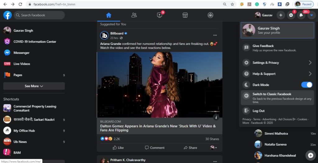
Facebook is officially releasing its redesigned website with dark mode and has added other features to make the desktop version easier to use and faster. The social media firm had previously launched the interface back in 2018 and had updated a limited number of users for testing since October last year.
The new layout is getting a simplified design for a more streamlined navigation approach, the redesign now mostly fills up the desktop screen from one end to the other, enabling easier discovery of videos, games, and even groups.
To activate the new Dark Mode, navigate to the website’s top-right dropdown menu, click on the “down” button, and select “Switch to new Facebook” to reduce the strain on the eyes.
The page will automatically switch to Dark Mode if it detects Chrome or Desktop settings have a feature enabled. In addition, if you wish, you can always turn back to the “old” version.
Navigating around the Facebook timeline is also very similar, with three columns shown on the page; the Shortcuts column on the left, the Pages and Contacts on the right, and the main timeline in the centre. In addition, Stories will also appear at the very top of timeline.
Above these columns is a top bar that provides easy access to the home page, user profile, Messenger, updates, search bar, and more.
Facebook says that the latest home page will load faster and the transition between pages will be smoother. Other than that, the company added that it can automatically adapt to various sizes of screens, regardless of the resolution.
